class: center, middle, inverse, title-slide # Graphics Group at LunchinatoRs ### Eryn Blagg, Katherine Goode, Haley Jeppson, Xiaodan Lyu, Kiegan Rice, Miranda Tilton, Joseph Zemmels ### 2019/11/08 --- <style> .remark-slide-content { background-color: #FFFFFF; border-top: 80px solid #23373B; font-size: 20px; font-weight: 300; line-height: 1.5; padding: 1em 2em 1em 2em } .title-slide .inverse .remark-slide-content { background-color: #FAFAFA; } .inverse { background-color: #23373B; text-shadow: none; } .title-slide { background-color: #FAFAFA; border-top: 80px solid #FAFAFA; } </style> <style type="text/css"> .left-code { color: #777; width: 40%; height: 92%; float: left; } .right-plot { width: 59%; float: right; padding-left: 1%; } .code-bg-gray .remark-code, .code-bg-gray .remark-code * { background-color:#E8E8E8!important; } </style> # Graphics Group - Working group in the statistics department - Interested in statistical graphics and computational tools - Meet once a week - Presentations from graduate students, faculty, alumni, and industry individuals - [Website](https://isu-graphicsgroup.netlify.com/): post titles and abstracts of weekly talks (sometimes links to the slides) --- class: inverse, center, middle # Figure 1 <!-- Katherine, I'm thinking that your slides may be more appropriate before mine since mine can be viewed as alternatives to the times series plots ~ Joe, that sounds good to me!--> --- # Original Figure <img src="../figures/1_Nate_Lawrence_Figure_20191018.png" width="2667" /> --- # Facets and More Variability in Color <img src="../figures/katherine/p1.png" width="1200" /> --- # Facets and More Variability in Color ### Code ```r # Set the color palette color_palette = colorRamps::blue2red(n = 8) # Create a theme for the figure 1 plots theme_fig1 <- theme_bw() + theme(strip.placement = "outside", strip.background = element_rect(color = "white", fill = "white"), legend.position = "bottom") # Plot fig1_3years_daily %>% ggplot(aes(x = date, y = value, color = elev)) + geom_point(alpha = 0.5, size = 0.5) + facet_grid(variable ~ year, scales = "free_y", switch = "y") + labs(x = "Date", y = "Hourly Values by Plot and Elevation", title = "Variable Plots by Topography 2017-2019", color = "Relative \nElevation") + scale_color_manual(values = color_palette) + theme_fig1 + guides(colour = guide_legend(nrow = 1, override.aes = list(size = 3, alpha = 1))) ``` --- # Summary Values: Daily Averages <img src="../figures/katherine/p4.png" width="1200" /> --- # Summary Values: Daily Averages ### Code ```r ggplot() + geom_point(data = fig1_3years_daily, mapping = aes(x = date, y = value), size = 0.25, color = "grey75") + geom_line(data = fig1_3years_daily_means, mapping = aes(x = date, y = value_mean, group = elev, color = elev)) + facet_grid(variable ~ year, scales = "free_y", switch = "y") + labs(x = "Date", y = "Daily Values by Elevation and Plot", title = "Variable Plots by Topography 2017-2019", color = "Relative \nElevation") + scale_color_manual(values = color_palette) + scale_fill_manual(values = color_palette) + theme_fig1 + guides(colour = guide_legend(nrow = 1)) ``` --- # Summary Values: Weekly Average <img src="../figures/katherine/p3.png" width="1200" /> --- # Summary Values: Weekly Average ### Code ```r ggplot(data = fig1_3years_weekly, mapping = aes(x = week_date, y = weekly_mean, group = elev)) + geom_ribbon(mapping = aes(ymin = value_min, ymax = value_max, fill = elev), alpha = 0.15, color = NA) + geom_line(mapping = aes(group = elev, color = elev), size = 1) + facet_grid(variable ~ year, scales = "free_y", switch = "y") + labs(x = "Date", y = "Weekly Values by Elevation and Plot", title = "Variable Plots by Topography 2017-2019", color = "Relative \nElevation", fill = "Relative \nElevation") + scale_color_manual(values = color_palette) + scale_fill_manual(values = color_palette) + theme_fig1 + guides(colour = guide_legend(nrow = 1)) ``` --- # Heat Map over Time - Time series plots displaying multiple categories can become complicated - For comparisons across categories, a "heat map" may be more effective <!-- - May reveal missing values or odd behavior to be further investigated --> .code-bg-gray[ ```r ggplot(data = soilMoisture_data, aes(x = date, y = plot, fill = soilMoisture)) + #"fill" colors interior of tile geom_tile() + ... #title, axes, and legend specifications ``` ] Example `geom_tile` output (NAs colored gray): <img src="../figures/JoePlots/soilMoisture_per_plot.png" width="420" /> --- # ggplot GIFs with animation package - Use physical time as a dimension of your plot (make an animation!) - Packages: `gganimate`, `animation` - `gganimate` is more robust, but `animation` may be simpler to implement <!-- The "expr" argument of saveGIF needs to be passed an expression that generates a series of plots (e.g., the walk statement below). I really just want to use the pseuodocode below to illustrate how one might use the saveGIF function. --> .code-bg-gray[ ```r pltList <- list(...) #list of ggplot objects animation::saveGIF(movie.name = "file_name.gif", expr = { purrr::walk(pltList,plot) #plot each element of pltList }) ``` ] 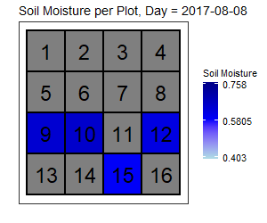<!-- --> --- class: inverse, center, middle # Figure 2 --- # Original Figure <img src="../figures/2_Bina_two-peaks-now.png" width="1748" /> --- # Scatter plot .left-code[ ```r library(dplyr); library(ggplot2) d2 <- read.table( "../data/2_Bina_two-peaks.csv", sep = ",", header = TRUE) d2 %>% ggplot(aes(x = TCG, y = TCW)) + geom_point( aes(color = PixelValues), alpha = .7) + * scale_color_gradientn( * colors = c("white", * "blue", * "red"), * values = c(0, .2, 1)) ``` ] .right-plot[ 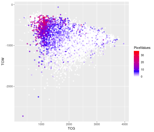 ] --- # 2-D density plot .left-code[ ```r d2 %>% ggplot(aes( x = TCG, y = TCW, z = PixelValues)) + * stat_summary_2d( * bins = 50, * fun = mean) + scale_fill_viridis_c( "PixelValues") + theme_bw(base_size = 15) + coord_equal() ``` ] .right-plot[ 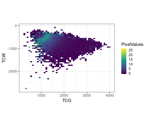 ] --- # Correlation matrix plot .left-code[ ```r library(GGally) my_bin <- function(data, mapping, ...){ ggplot(data = data, mapping = mapping) + geom_bin2d() + scale_fill_viridis_c() } d2 %>% select( TCB, TCG, TCW, PixelValues) %>% * ggpairs( * lower = list( * continuous = my_bin * )) ``` ] .right-plot[ 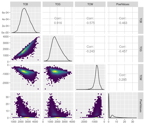 ] --- class: inverse, center, middle # Figure 3 --- # Original Figure <img src="../figures/3_crop-sys-compare-sketch-idea.png" width="5376" /> --- # Without changing Scales <img src="../figures/Eryn/Figure03plot01.png" width="812" /> --- # Now with porportions <img src="../figures/Eryn/Figure3plot02.png" width="812" /> --- class: inverse, center, middle # Figure 4 --- # Original Figure <img src="../figures/4_two-variables.png" width="3567" /> --- # With Modifications .left-code[ ```r ggplot(X4_data) + geom_hline(aes(yintercept = 0), linetype = "dashed", alpha = .7) + geom_vline(aes(xintercept = 0), linetype = "dashed", alpha = .7) + annotate("text", y = -4.5, x = 4, label = "(-) yield, (+) weed", alpha = .9) + annotate("text", y = 4.5, x = -4, label = "(+) yield, (-) weed", alpha = .9) + geom_point(aes(y = yieldLRR, x = weedLRR), alpha = .8, color = "gray10") + ylim(c(-6,6)) + xlim(c(-6.5,6.5)) + theme(legend.position = "none") + scale_fill_manual(values=c("ivory2", "tomato", "yellowgreen", "ivory2")) + labs(title = "Yield Response vs. Weed Response to Cover Crop", x = "weed response to cover crop", y = "yield response to cover crop") + theme_bw() ``` ] .right-plot[ 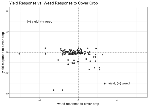 ] --- # Add background color .left-code[ ```r ggplot(X4_data) + geom_rect(data = dat, aes(ymin = xmin, ymax = xmax, xmin=ymin, xmax = ymax, fill = cat), alpha = 0.3) + geom_hline(aes(yintercept = 0), linetype = "dashed", alpha = .7) + geom_vline(aes(xintercept = 0), linetype = "dashed", alpha = .7) + annotate("text", y = -4.5, x = 4, label = "(-) yield, (+) weed", alpha = .9) + annotate("text", y = 4.5, x = -4, label = "(+) yield, (-) weed", alpha = .9) + geom_point(aes(y = yieldLRR, x = weedLRR), alpha = .8, color = "gray10") + ylim(c(-6,6)) + xlim(c(-6.5,6.5)) + scale_fill_manual(values=c("ivory2", "yellowgreen", "tomato", "ivory2")) + labs(title = "Yield Response vs. Weed Response to Cover Crop", x = "weed response to cover crop", y = "yield response to cover crop") + theme_bw() + theme(legend.position = "none") ``` ] .right-plot[ 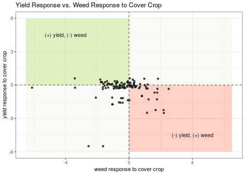 ] --- # Experimental Option .left-code[ ```r ## modify data X4_data_mod <- X4_data[complete.cases(X4_data),] %>% mutate(yield = ifelse(yieldLRR > 0, "pos_yield", "neg_yield"), weed = ifelse(weedLRR > 0, "pos_weed", "neg_weed")) %>% unite(quad, yield:weed) %>% select(-obs_no) %>% group_by(quad) %>% arrange(yieldLRR, .by_group = TRUE) %>% ungroup() %>% mutate(id = 1:109) %>% gather(measurement, value, -c(id, quad)) ## code for plot ggplot(X4_data_mod) + geom_hline(aes(yintercept = 0), linetype = "dashed", alpha = .7) + geom_bar(aes(x = id, weight = value, fill = measurement), position = "dodge", width = 1.2) + coord_flip() + ylim(c(-6.5,4)) + scale_fill_manual(values=c("#999999", "#E69F00")) + labs(x= "observation", y = "LRR", title = "Weed and Yield LRR") + theme_bw() + theme(legend.position = "bottom") ``` ] .right-plot[ 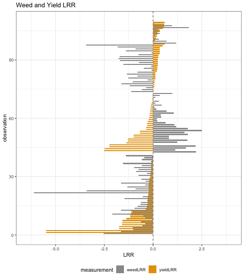 ] --- class: inverse, center, middle # General Recommendations --- # How to Ask For Help (With Data) - Context, context, context! - Medium of visualization - Goal of visualization --- # Providing Context - Having data is great! - Numbers alone often don't mean anything - How can you provide necessary context? --- # Providing Context - Describe the study or how the numbers were obtained - Variables in your dataset: - Categorical or "Word/letter": What do they mean? - Numerical: What do the numbers represent? - Raw measurements? - Percentages or proportions? - How were proportions calculated? - Change over time or difference between groups? --- # Medium of the Visualization - Who is the audience? - Researchers in your field - Researchers from other fields - This helps determine how much context you need! - Students - Coworkers - Where is the visualization going to be used? - Journal article - Formatting requirements - Presentation - Talk - Poster - What is your presentation style? --- # Goal of the Visualization - Most data can be visualized in many different ways! - What is the purpose of the visualization? - Background information - Example of the data structure - Demonstrating data patterns - What do you want the audience to get out of the visualization? - Is there a trend, effect, or ordering you want to emphasize? --- # Goal of the Visualization [Examples from Nathan Yau's FlowingData](https://flowingdata.com/) <img src = "../figures/kiegan/flowingdata-individual-countries.png" width="45%"/> <img src = "../figures/kiegan/flowingdata-individual-countries-together.png" width="45%"/> --- # Goal of the Visualization [Examples from Nathan Yau's FlowingData](https://flowingdata.com/) <img src = "../figures/kiegan/flowingdata-comparing-two-years.png" width="80%"/> --- # Annotating Figures - Labels and captions are really important! - Always include units when labeling axes - Add a figure caption which provides context --- # Labelling in `ggplot2` .code-bg-gray[ ```r iris %>% ggplot() + geom_point(aes(x = Sepal.Length, y = Petal.Length, color = Species)) + theme_bw() ``` ] 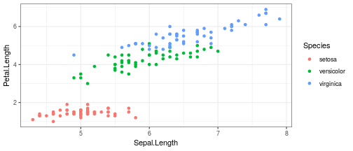<!-- --> --- # Labelling in `ggplot2` .code-bg-gray[ ```r iris %>% ggplot() + geom_point(aes(x = Sepal.Length, y = Petal.Length, color = Species)) + theme_bw() + * labs(x = "Sepal Length (cm)", * y = "Petal Length (cm)", * title = "Sepal Length vs. Petal Length in Iris Varieties") ``` ] 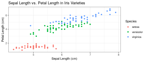<!-- --> --- # Labelling in `ggplot2` .code-bg-gray[ ```r iris %>% ggplot() + geom_point(aes(x = Sepal.Length, y = Petal.Length, color = Species)) + theme_bw() + * labs(x = "Sepal Length (cm)", * y = "Petal Length (cm)", * title = "Sepal Length vs. Petal Length in Iris Varieties") + * scale_color_manual(name = "Iris Species", * values = c("mediumorchid4", "plum", "darkblue"), * labels = c("I. Setosa", "I. Versicolor", "I. Virginica")) ``` ] 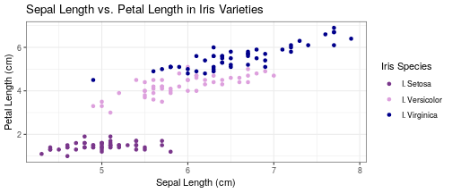<!-- -->