An Introduction to ggResidpanel
ggResidpanel version 0.3.0.9000
introduction.RmdggResidpanel was developed with the intention of providing an easier way to both create and view diagnostic plots for models in R. The graphics are created using ggplot2, and interactive versions of the plots are rendered using plotly. This vignette provides a brief introduction to ggResidpanel with information on how to install the package, a description of the functions included in the package, and examples. To learn more about ggResidpanel, read through the ggResidpanel Tutorial and User Manual, which contains the details for all of the functions in the package and demonstrates how to use them.
Functions
ggResidpanel has five functions:
-
resid_panel: Creates a panel of diagnostic plots of the residuals from a model -
resid_interact: Creates an interactive panel of diagnostic plots of the residuals from a model -
resid_xpanel: Creates a panel of diagnostic plots of the predictor variables -
resid_compare: Creates a panel of diagnostic plots from multiple models -
resid_auxpanel: Creates a panel of diagnostic plots based on the predicted values and residuals from models not included in the package
Currently, ggResidpanel allows the first four functions listed above to work with models fit using the functions of lm and glm from base R, lme from nlme, and lmer or glmer from lme4 (or fit using lmerTest).
Examples
Emperor penguins are able to dive under the water for long periods of time. The dataset penguins included in ggResidpanel contains information from a study done on the dives of emperor penguins. The scientists who conducted the study were interested in understanding how the heart rate of the penguins related to the depth and duration of the dives. A device was attached to penguins that recorded the heart rate of the bird during a dive.
The structure of the data is shown below. It has four variables:
- heart rate of the penguin (beats per minute)
- depth of the dive (meters)
- duration of the dive (minutes)
- bird associated with the dive
There were 9 penguins included in the study with multiple observations taken from each bird and a total of 125 observations in the dataset.
str(penguins)
#> 'data.frame':    125 obs. of  4 variables:
#>  $ heartrate: num  88.8 103.4 97.4 85.3 60.6 ...
#>  $ depth    : num  5 9 22 25.5 30.5 32.5 38 32 6 10.5 ...
#>  $ duration : num  1.05 1.18 1.92 3.47 7.08 ...
#>  $ bird     : Factor w/ 9 levels "1","2","3","4",..: 1 1 1 1 1 1 1 1 1 1 ...
The code below shows the number of observations per penguin. Penguin number 6 has the least with only 6, and penguin number 1 has the most with 20.
table(penguins$bird)
#>
#>  1  2  3  4  5  6  7  8  9
#> 20 12 10 17 16  6 14 13 17
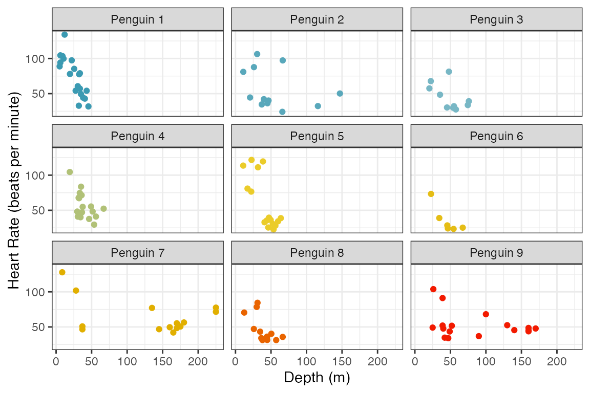
The figure below shows scatter plots of heart rate versus depth of a dive for each penguin. The points are colored by bird number. This data shows a decrease in heart rate as the depth of the dive increases, but the manner in which the heart rate decreases varies between penguins.
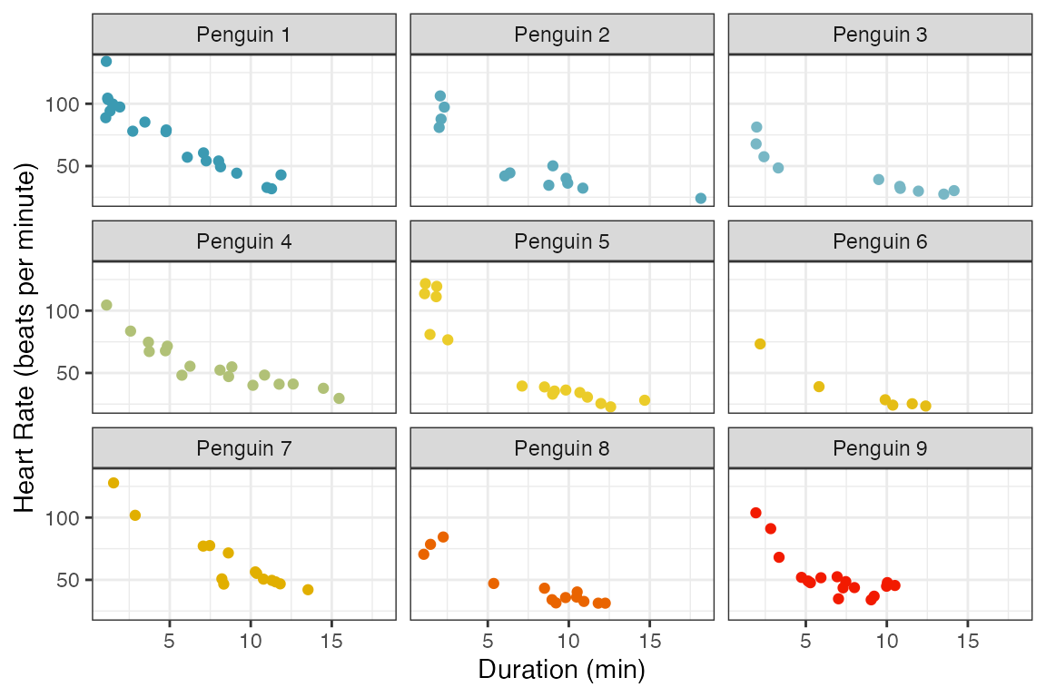
The next figure shows the heart rate versus duration of the dive for each penguin. Again, there is a clear decrease in heart rate as the duration of the dive increases. The trends are very similar between penguins.
To model the data, a linear mixed effects model is fit below with heart rate as the response variable. To start, depth and duration are included as fixed main effects in the model, and a random effect for penguin is specified.
The summary of the model is shown below.
summary(penguin_model)
#> Linear mixed model fit by REML ['lmerMod']
#> Formula: heartrate ~ depth + duration + (1 | bird)
#>    Data: penguins
#>
#> REML criterion at convergence: 991.6
#>
#> Scaled residuals:
#>     Min      1Q  Median      3Q     Max
#> -1.9927 -0.5966 -0.1473  0.4853  3.1947
#>
#> Random effects:
#>  Groups   Name        Variance Std.Dev.
#>  bird     (Intercept)  53.7     7.328
#>  Residual             144.8    12.033
#> Number of obs: 125, groups:  bird, 9
#>
#> Fixed effects:
#>             Estimate Std. Error t value
#> (Intercept) 94.38863    3.47662  27.150
#> depth        0.05961    0.03260   1.828
#> duration    -5.72498    0.30836 -18.566
#>
#> Correlation of Fixed Effects:
#>          (Intr) depth
#> depth    -0.232
#> duration -0.418 -0.459
Diagnostic Panels with resid_panel
There are four key assumptions to check for this model.
- Independence of observations
- Linearity between the response variable and the predictor variables
- Constant variance of the residuals
- Normality of the residuals
The first assumption can only be checked by considering the study design. In our case, there is a dependence between observations taken from the same penguin, and we already accounted for this by including a random effect for penguin in the model. The other assumptions can be checked by looking at residual diagnostic plots. These plots can be easily created by applying the function resid_panel from ggResidpanel to the model. By default, a panel with four plots is created. This is demonstrated below by applying resid_panel to the penguin_model. The default panel includes the following four plots.
Residual Plot (upper left): This is a plot of the residuals versus predictive values from the model to assess the linearity and constant variance assumptions. The curving trend seen in the
penguin_modelplot suggests a violation of the linearity assumption, and there appears to be a violation of the constant variance assumption as well since the variance of the residuals is getting larger as the predicted values increase.Normal Quantile Plot (upper right): Also known as a qq-plot, this plot allows us to assess the normality assumption. There appears to be a deviation from normality in the upper end of the residuals from the
penguin_model, but this is not as much of a concern as linearity and constant variance issues.Histogram (lower right): This is a histogram of the residuals with a overlaid normal density curve with mean and standard deviation computed from the residuals. It provides an additional way to check the normality assumption. This plot makes it clear that there is a slight right skew in the residuals from the
penguin_model.Index Plot (lower left): This is a plot of the residuals versus the observation numbers. It can help to find patterns related to the way that the data has been ordered, which may provide insights into additional trends in the data that have not been accounted for in the model. There is no obvious trend in the
penguin_modelindex plot.
resid_panel(penguin_model)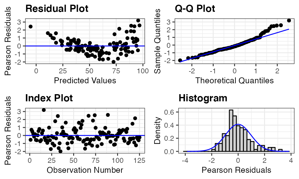
All functions in the package include a plots option that allows users to specify which plots to include in the panel. Users can either specify an individual plot, a vector of plot names, or a prespecified panel.
Plot Names:
-
"boxplot": A boxplot of residuals -
"cookd": A plot of Cook’s D values versus observation numbers -
"hist": A histogram of residuals -
"index": A plot of residuals versus observation numbers -
"ls": A location scale plot of the residuals -
"qq": A normal quantile plot of residuals -
"lev": A plot of standardized residuals versus leverage values -
"resid": A plot of residuals versus predicted values -
"yvp":: A plot of observed response values versus predicted values
Note that the plots of “cookd”, “ls”, and “lev” are only available for models fit using lm and glm and cannot be selected with resid_auxpanel.
Prespecified Panels:
-
"all": panel of all plots in the package that are available for the model type -
"default": panel with a residual plot, a normal quantile plot of the residuals, an index plot of the residuals, and a histogram of the residuals -
"R": panel with a residual plot, a normal quantile plot of the residuals, a location-scale plot, and a residuals versus leverage plot (modeled after the plots shown in R if theplotfunction is applied to an lm model) -
"SAS": panel with a residual plot, a normal quantile plot of the residuals, a histogram of the residuals, and a boxplot of the residuals (modeled after the residpanel option in proc mixed from SAS)
Note that the "R" option can only be used with models fit using lm and glm.
Here is an example requesting a panel with all plots available for a model fit using lmer.
resid_panel(penguin_model, plots = "all")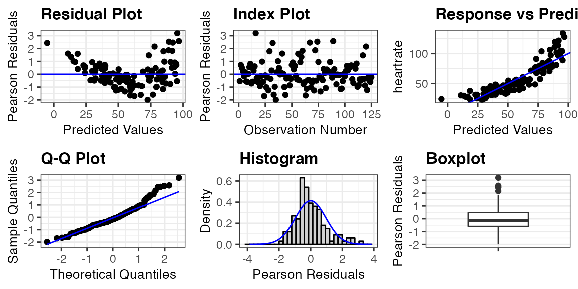
Interactivity with resid_interact
The static panel of plots does not allow one to easily identify an observation associated with a point of interest. The function resid_interact allows users to interact with the plots thanks to plotly. The code below creates a panel with a residual plot and qq-plot with interactivity. When the cursor is hovered over a point, a tooltip appears with the x and y location of the point, the observed values from variables included in the model associated with the point, and the observation number. This function is meant to help users identify outliers and points of interest in the plot.
resid_interact(penguin_model, plots = c("resid", "qq"))Incorporating Predictor Variables with resid_xpanel
To further assess the issues with a model, it may be helpful to look at plots of the residuals versus the predictor variables. This can be done easily by applying the function resid_xpanel to the model.
The code below creates a panel with a plot included for each predictor variable in the penguin_model. That is, three plots are created for the variables of depth, duration, and bird. Pearson residuals are plotted on the y-axis for each of the plots. These plots show a clear decrease in variation of the residuals as the value of depth increases, and the nonlinear relationship appears to be related to the variable of duration. The plot of residuals versus bird shows no obvious trend and relatively constant variance across the penguins.
resid_xpanel(penguin_model, jitter.width = 0.1)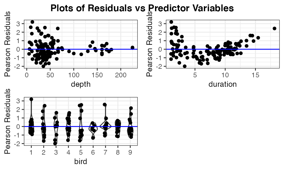
The function resid_xpanel has the option to plot the response variable on the y-axis by setting yvar = "response". The updated code and resulting panel of plots is shown below. The plot of heart rate versus duration suggests that including a quadratic term for duration may help improve the model fit.
resid_xpanel(penguin_model, yvar = "response", jitter.width = 0.1)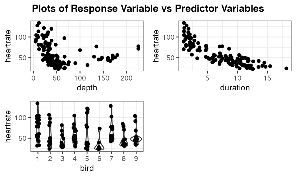
Model Comparisons with resid_compare
To deal with the violations of the model assumptions in the penguin_model, two new models are fit. The first (penguin_model_log) uses a log transformation of the heart rate as the response, and the second model penguin_model_log2 uses both a log transformation of the response and a quadratic term for duration.
penguin_model_log <- lmer(log(heartrate) ~ depth + duration + (1|bird),
                       data = penguins)
penguin_model_log2 <- lmer(log(heartrate) ~ depth + duration + I(duration^2) + (1|bird),
                       data = penguins)
The function resid_compare allows the residual plots from multiple models to be compared side by side. The first argument in resid_compare is a list of the models to compare. In the code below, the models fit to the penguin data are included in the list, and the resid, and qq plots are selected to be included in the panel to assess the linearity, constant variance, and normality assumptions. Some additional options have also been specified, which are available in other functions of the package as well. The option of smoother = TRUE adds a smoother to the residual plots, and qqbands = TRUE adds a 95% confidence interval to the qq-plot. The option of title.opt = FALSE removes the titles from the plots. The resulting panel includes plots where each column contains the plots associated with one of the models. The plots are ordered from left to right following the order the models were specified in the list.
The log transformed model still shows some curvature in the residual plot and skewness in the normal quantile plot. However, the model with both the log transformation and a quadratic term for duration appears to meet all of the assumptions.
resid_compare(models = list(penguin_model,
                            penguin_model_log,
                            penguin_model_log2),
              plots = c("resid", "qq"),
              smoother = TRUE,
              qqbands = TRUE,
              title.opt = FALSE)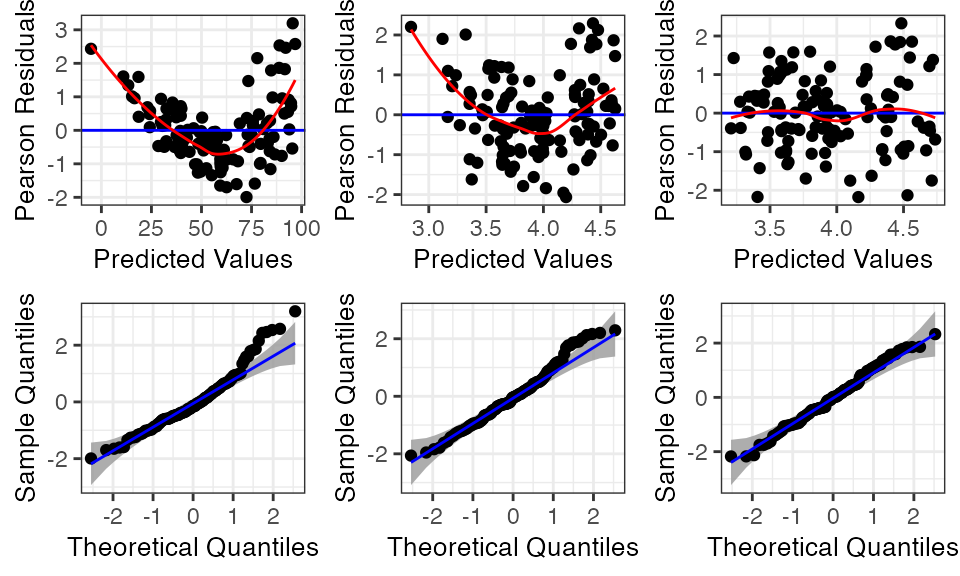
Additional Model Types with resid_auxpanel
The function resid_auxpanel has been included in the package to allow for the creation of diagnostic plot panels with models that are not included in the package. For example, if there was a desire to try fitting a regression tree to the penguins data, it would not be possible to create residual plots with any of the ggResidpanel functions considered so far.
A regression tree is fit to the penguins data below using the rpart package.
penguin_tree <- rpart::rpart(heartrate ~ depth + duration, data = penguins)We can extract the predicted values from the regression tree and use these to compute the residuals for the model.
penguin_tree_pred <- predict(penguin_tree)
penguin_tree_resid <- penguins$heartrate - penguin_tree_pred
The function resid_auxpanel accepts the residuals and predicted values as inputs and uses these to create diagnostic plots. Since some of the plots available in the package require additional information from a model (cookd, lev, and ls), they cannot be used with resid_auxpanel as previously mentioned.
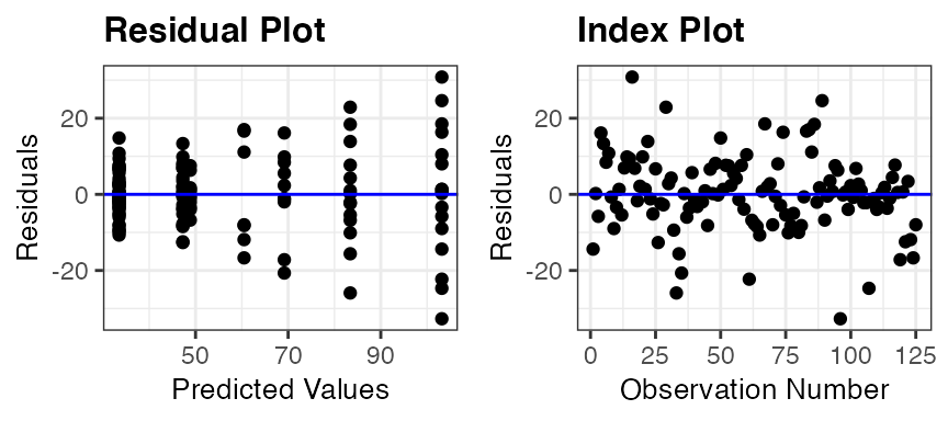
The code below takes the residuals and predicted values from penguin_tree and creates a panel with a resid and index plot. The residual plot shows an increase in variance, and it may be of interest to adjust for this in some way with the model. The index plot does not show any concerns.
resid_auxpanel(residuals = penguin_tree_resid,
               predicted = penguin_tree_pred,
               plots = c("resid", "index"))